Click on the icon above to use the interface
Date: March 2022 – July 2023
Client: Audubon North Carolina
My Role: UX/UI developer, web developer, graphic designer, writer, instructional designer.
Tools: Adobe Photoshop, Adobe Premiere, Adobe XD, Adobe Illustrator, Pages, Instagram, Ceros, WordPress.
For my thesis project in my Master’s Program, I created a website for The National Audubon Society that teaches professionals how to navigate through Instagram. After interning for Audubon North Carolina last summer, I noticed that my colleagues that were 55 and older struggled to create content for Instagram. To resolve this issue, I wanted to create an interactive web interface to provide more senior Audubon professionals with resources.
Problem
In the summer of 2019, I was the social media/communications intern at Audubon, North Carolina. My primary goal was to relaunch the company’s Instagram (IG) account. While researching other Instagram accounts within the company, I noticed several accounts were performing poorly. I learned that many smaller Audubon IG accounts are run by older individuals unfamiliar with Instagram. Due to the small size of the volunteer branches, account owners were often unaware of the social media resources Audubon offered.
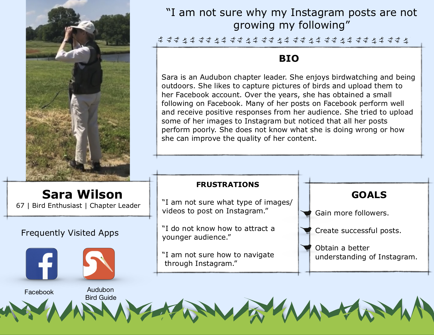
Target Audience

I hosted a social media webinar when I interned at Audubon NC, in the summer of 2019. This webinar aimed to educate several chapter leaders on how to use Instagram. All of the participants in this webinar are in my target audience. I created a Google Survey to learn what content to include on the website. Ten chapter leaders out of 15 responded to this survey.
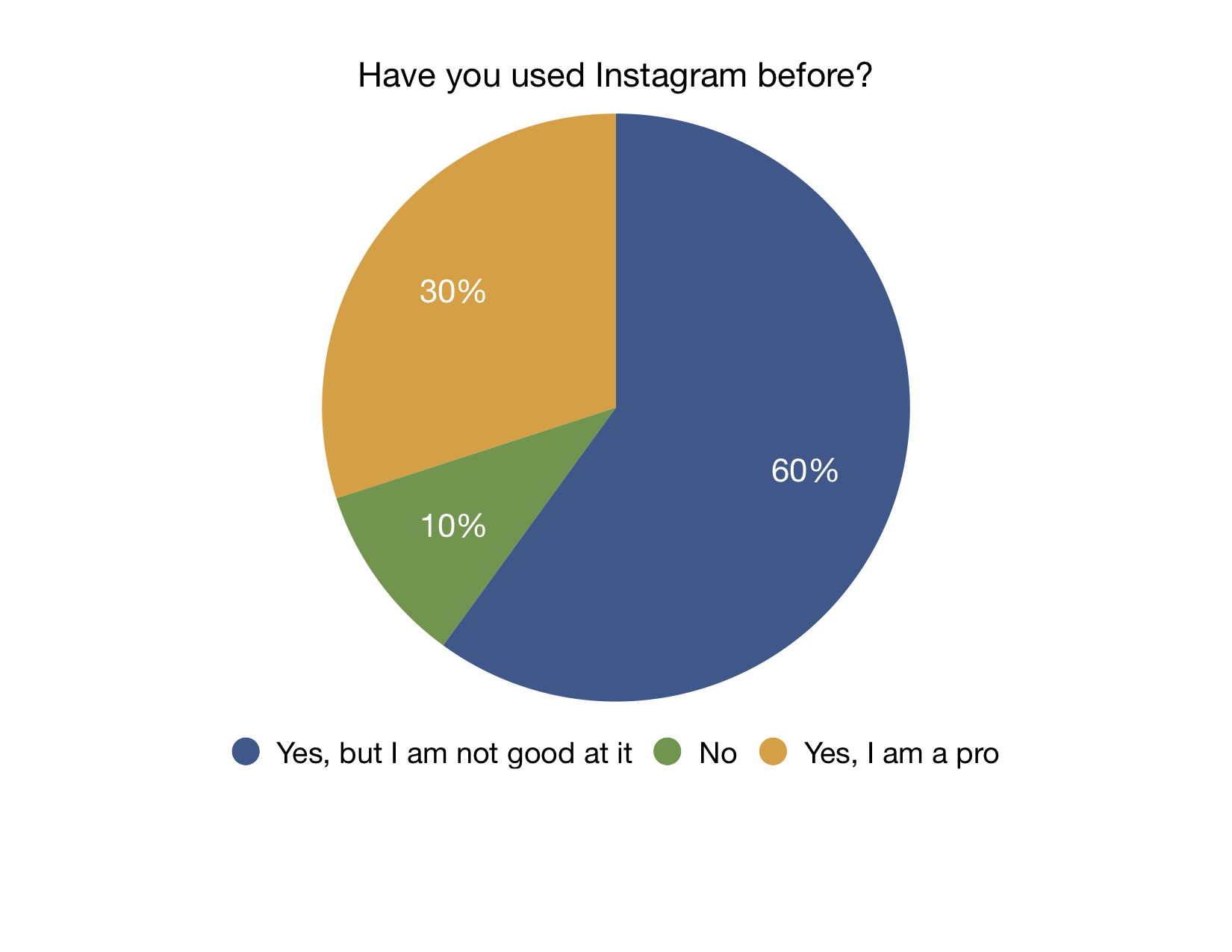
I created a pie chart to display the data obtained from the Google Survey. The chart shows that most chapter leaders generally understand Instagram but need help using the platform.

I created a mind map to correspond with the wants and needs of my target audience. Then, I tried to brainstorm content ideas that would be helpful and interactive.
Solution
After examining the results of the survey, it was clear that the client would need a website that contained general information about Instagram, tips on gaining and maintaining followers, and helpful tools the company could use to create successful posts.
Prototyping


I used construction paper and flashcards to create a paper prototype of my website. I wanted the site to resemble Instagram as much as possible. This would help familiarize my audience with Instagram’s site icons and navigation.
Iteration 1


I sketched the wireframe for iteration 1 onto a sheet of paper. The first iteration of the website was created to look like a field guide next to a cellphone. Professionals at Audubon are familiar with using a field guide when birdwatching. I wanted to develop a sense of comfort for the user by presenting them with familiar icons.
After creating the icons I sketched in Adobe Illustrator, I imported everything into Adobe XD to create the prototype for the first iteration of the website.
Iteration 2


The client enjoyed the first iteration but felt like something was missing. I wanted to refine the first iteration by emphasizing the cellphone icon. I sketched a wireframe of what the second iteration would look like, along with several background elements. My goal was to expound upon the original idea.
I created new icons in Adobe Illustration and imported them into Adobe XD. Instead of using a field guide to navigate to a new page, I made bottom navigation elements. The second iteration also contains background icons and more small aesthetic details.
I uploaded all of my icons to a website called Ceros. Ceros is a website that allows users to upload icons from Illustrator to create a website without the need to code. After users construct their websites in Ceros, it produces a code for them to embed in the backend of a web host.
By using Ceros, I could add a pulse animation to every button, hover animations, transitions, pop-ups, and bottom navigation.
Iteration 3


The feedback I received on iteration 2 indicated that multiple pulsating buttons were overwhelming. Therefore, iteration 3 would focus on refining the site’s navigation. I sketched a wireframe for iteration 3 to visualize how the user would experience the website. Instead of using buttons to trigger pop-up windows, I created a side menu. Much like the original field guide idea, this menu would work as a table of contents for each page.
I went back into Adobe XD to modify the bottom navigation elements and pop-up windows. I noticed that the bottom navigation was difficult to see against the background, so I added a white box behind each icon. I recreated the pop-up windows because I had sizing issues with the videos. The new version of the pop-up windows allowed me to include more written content as well as include videos of all sizes. After emailing the client, I decided to add a resource page. This page contains links to helpful articles, company resources, and social media apps.
I recorded a video walk-thru of the website’s new layout for the client and my peers to review. I highlighted areas of improvement and places I would like feedback.
Iteration 4


The client and my peers agreed that the addition of the side menu was a significant improvement. My peers suggested I change the pulsating red icon over the phone to something more subtle. The use of red typically indicates a warning or error. In iteration 4, I made several site icons and navigation improvements. The client requested that I add an “about page” to be known throughout the company for creating this website. I made a wireframe to reflect the final changes to the site.
I created a site logo in the corner of the new top navigation menu. Instead of a red flashing arrow, I changed the icon to a hummingbird. This new icon was less offensive while still reflecting the company’s aesthetic. I also added an about page that briefly overviews who I am and why I decided to create this website for The National Audubon Society.
The fourth and final iteration of the website was well-perceived by my peers and the client. I changed the main font I used throughout the website to ensure that things were cohesive. All of the clickable elements had hover animations that triggered pop-up windows. The majority of the videos were short gifs I created in Adobe Premiere.
After the client reviewed the final version of the website, I went back into Adobe XD to create a prototype for the mobile/ tablet versions of the website.
In iteration 2, I utilized buttons as one of the primary ways to navigate the site. I implemented this idea into iteration 4 with minor adjustments to suit the client. For example, unlike iteration 2, none of the buttons pulsate or flash, which was the initial issue my peers and the client had with iteration 2. I also created pop-up windows that allowed the user to toggle between a video and written content.
Outcome
The interface was shared throughout the company. The client often recommends this tool to smaller chapters as a resource to help improve their Instagram accounts.
Next: Audubon’s Instagram Account