Click on the icon below to interact with the interface.
Date: June 2022 – January 2023
Client: Appalachian Voices
My Role: Writer, Graphic Designer, Instructional Designer, Web Developer.
Tools: Adobe Photoshop, Adobe Illustrator, Ceros, WordPress.
I worked with Appalachian Voices to create an interactive interface that explains the process of coal mine reclamation. The interface utilizes visual storytelling, images, videos, and short facts to simplify coal mine reclamation.
Problem
The client emphasized the need to simplify the process of coal mine reclamation to raise awareness about it. They had several articles that reference coal mine reclamation but failed to provide an in-depth explanation of the process of coal mine reclamation. In addition to this issue, the client noticed it was common for people in the community
to have trouble understanding the concept of coal mine reclamation.
Target Audience

The target audience consists of individuals 20 and older. These adults live within the community and value knowing what is happening around them. These individuals may show interest in conservation but struggle to understand dense information.
Solution
I proposed creating an interactive interface that simplified coal mine reclamation. My goal was to create something visually appealing and educational. The final product would be ready for the client to implement in a short-period of time.
Iteration 1
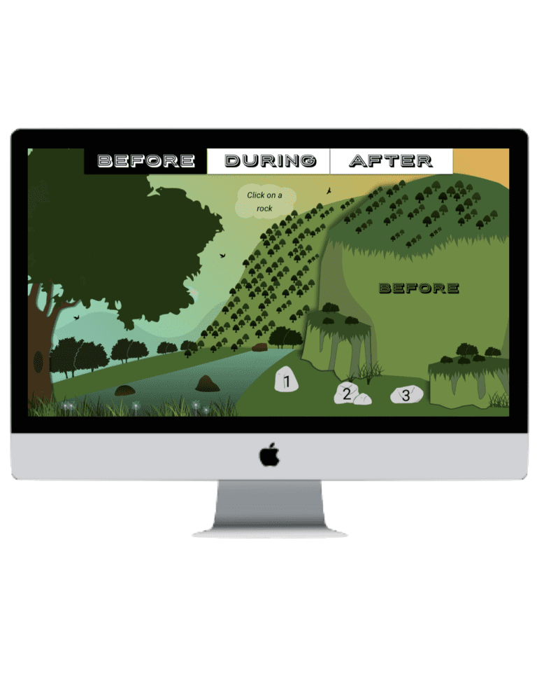
After speaking with the clients and considering their suggestions, I came up with the first iteration of the interface. I propose a one-page layout. The coal would guide you along the process of coal mine reclamation. I utilized Adobe Illustrator to create each icon and imported them into Ceros. Ceros is an application that allows users to create animated interfaces, web layouts, websites, and other interactive forms of media. I chose this medium because it would allow me to deliver a fully functioning interface in a short-period of time.
Iteration 2

The client liked the idea of a pathway to guide users along as they interacted with the interface. The client requested to have a map integrated into the interface, as well as a title. Iteration 2 expounds upon the ideas the client highlighted when we were initially discussing the layout of the interface.
I created the first video walk-through to show the client how a user would interact with the interface. To navigate through the interface, the user would first click on a piece of coal. Then select either “next” or “back to continue their journey. Users could also press the “X” icon to minimize the pop-up.
I added an image that appeared on the mountain to the right of the pop-up. The client stated they wanted the interface to conatin graphics that corealte with the pop-ups.
Iteration 3


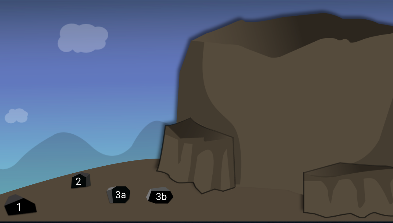
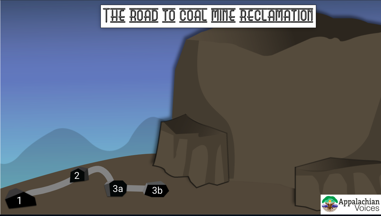
I received feedback from the client about the font and the lack of color on the interface. For iteration 3, I created colored pathways with a “path guide” map to help explain the colors. The client enjoyed this idea. I adjusted the font of the title across the top of the page.
When I provided the client with a walkthrough of Iteration 3, they felt it was getting overwhelming. The client enjoyed the colors I implemented but felt the pathways were confusing. The client also noted that she liked the shovel icons I’d implemented.
I agreed with the client’s perspective. I recommended adding a few pages to the interface to space things out. I explained to the client that this would achieve the same storytelling effect while feeling less cluttered.
Iteration 4
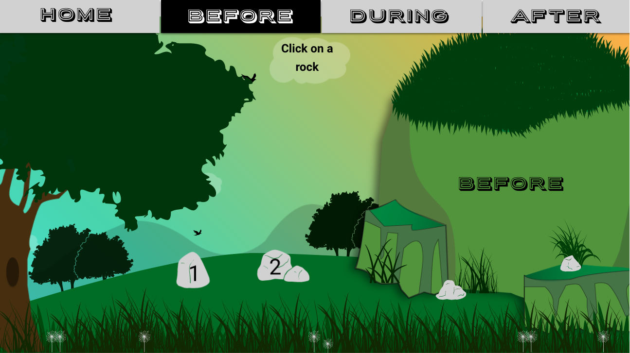

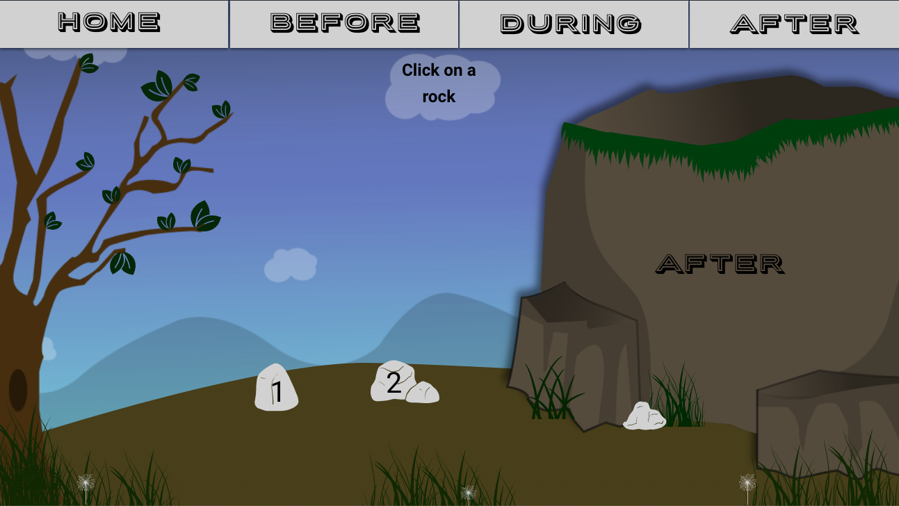
Iteration 4 showcases the final layout of the interface. Instead of the original 1-page layout, I created a total of 3 pages to tell the story of coal mine reclamation.
Each page has unique colors that correlate with the quick facts in the pop-ups. The client emphasized that they enjoyed using coal and rocks to navigate through each page. I kept that functionality on each page, in addition to adding a navigational menu in place of the original title.
While creating Iteration 4, I tried to implement Blooms Taxonomy. The client stressed the importance of this tool being both fun and educational. My goal was to create an interface that would help the average person understand the process of coal mine reclamation.
The clients suggestion to add more color gave the interface a whimsical feeling. This will grab the attention of the target audience. This version of the interface is visually appealing and influences the user to click around. I animated the rocks and pieces of coal to pulsate.
Final Product
The final product has many small details that play a role in the storytelling aspect of the interface.
I simplified each page to avoid confusion. Coal and rocks are used to navigate through each pop-up. Each page has subtle changes related to each stage of reclamation.
The river on each page changes from a bright blue to a dirty yellow, to a translucent clear. The client loved how each page told a different story.
I exported the final product through the Ceros interface to provide the client with a code. The code would allow the client to embed the finished interface inside of an article on their webpage.
After the interface was finalized, I created posts in Canva to advertise the interface. The client used these posts on Instagram, Facebook, and Twitter.
Outcome
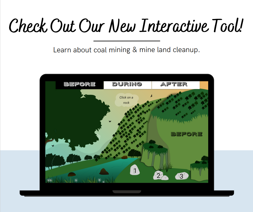
The interface I created for Appalachian Voices is currently used to educate adults about the process of coal mine reclamation in the Appalachian mountains.
Link for the interface: https://appvoices.org/coal-impacts/mine-walkthrough/